McDonalds Ordering App
McDonald’s Restaurant App is a helpful way to order and pay for food when you’re in a hurry.
Course:
Google UX Design Certification
Project Duration:
March - August 2021
Team Member:
Dane Yankowich
My Role:
Lead UX Designer, UX Researcher, etc.
RESEARCH
User Research:
I conducted interviews and created empathy maps to understand the users I’m designing for and their needs. A primary user group identified through research was working adults who don’t have time to cook meals.
This user group confirmed initial assumptions about McDonald’s customers, but research also revealed that time was not the only factor limiting users from making meals at home. Other user problems included obligations, interests, or challenges that make it difficult to get groceries for making meals or going to restaurants in-person.
USER PAIN POINTS:
Time
Working adults are too busy to spend time on making meals
2. Accessibility
Platforms for ordering food are not equipped with assistive technologies
3. IA
Text-heavy menus in apps are often difficult to read and order from
4. Payment Options
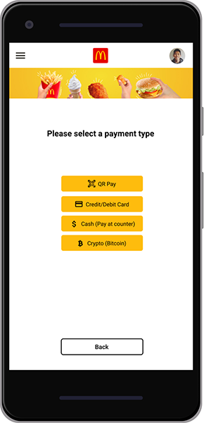
Users are looking for more ways to pay for their purchased items than traditional means
ANALYSIS
USER PersonaS


USER JOURNEY MAPPING:
Mapping Olivia’s user journey revealed how helpful it would be to reduce the amount of time it takes to order and pay for food.
IDEATE AND SKETCHING
PAPER WIREFRAMES
Taking the time to draft iterations of each screen of the app on paper ensured that the elements that made it to digital wireframes would be well-suited to address user pain points. For the home screen, I prioritized a quick and easy ordering process to help users save time.

LoW-Fi Digital Wireframes
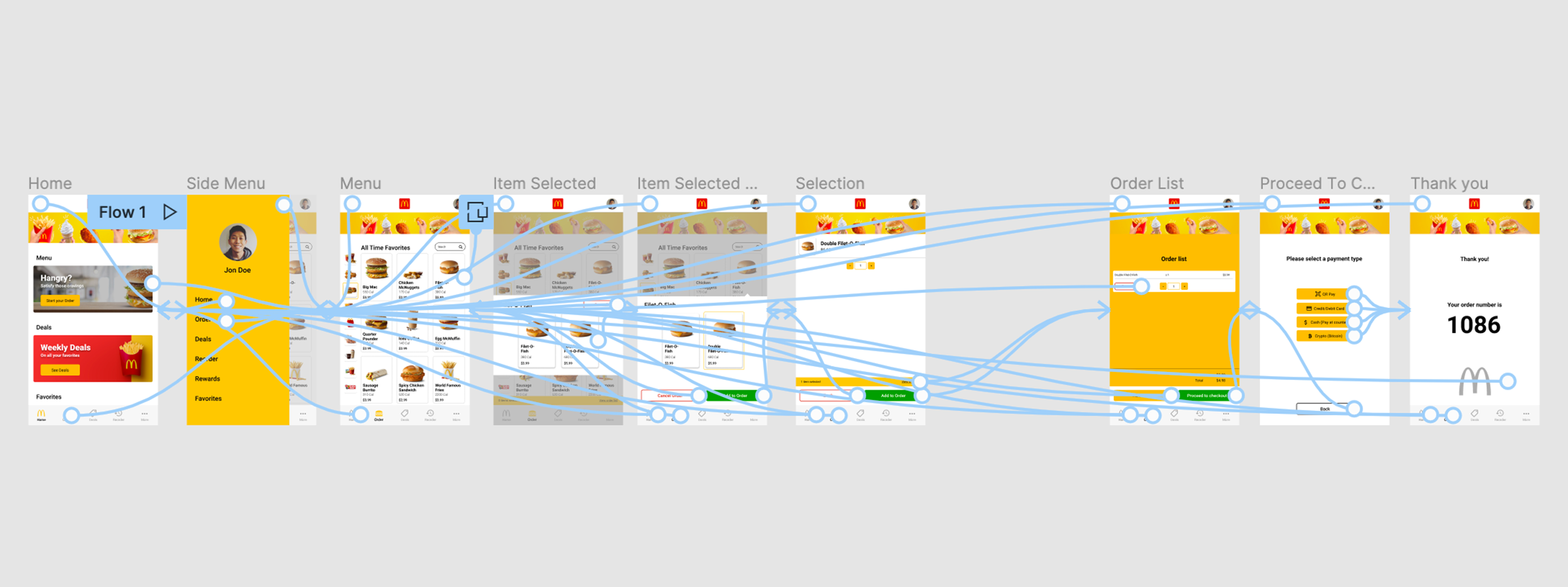
Based on the sketches I have drawn, I came up with some wireframes of the ordering flow to give myself a better view of what the better system can potentially look and feel like. This also helped me to identify problems in the flow and make corrections.
View the McDonalds low-fidelity prototype

I conducted two rounds of usability studies. Findings from the first study helped guide the designs from wireframes to mockups. The second study used a high-fidelity prototype and reveals what aspects of the mockups needed refining.
USAbility study findings:
ROUND 1 findings
Users wanted to order food quickly
Users want more pay options
Users want to be able to visualize the products
ROUND 2 FINDINGS
Users are having difficulty navigating easily in app
Once finished order, users want more confirmation they are finished
REFINE THE DESIGN

Food Type Selection Revealer Comparison
Food Type Selection Revealer Comparison


Early designs allowed for some customization, but after the usability studies, I added additional options to minimize screen real estate.
The second usability study revealed frustration with not knowing which button to select. I consolidated the “Change Choice” and “Customize” buttons to one “Customize” button.
HIGH-Fi DESIGNS


High FIDELITY PROTOTYPE
The final high-fidelity prototype presented cleaner user flows for ordering and checkout. It also met user needs to better visualize the menu, an easier navigation in app and more options for payment.
View the McDonalds high-fidelity prototype
Provided access to users who are vision impaired through adding alt text to images for screen readers.
Used detailed imagery for menu items to help all users better understand ordering options.
Used icons to help make navigation easier.