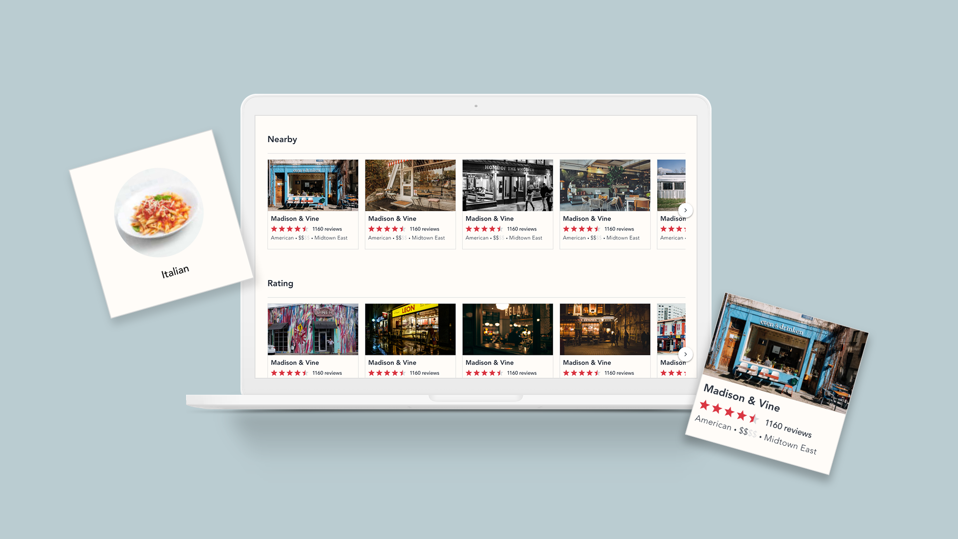
Restaurant ReviewS Website
Restaurant Reviews is an online restaurant review service that allows customers to share, review and rate their dining experiences.
Restaurant Reviews goal is to make the dining experience better for all, by receiving insight before you dine.
Course:
Google UX Design Certification
Project Duration:
August - September 2021
Team Member:
Dane Yankowich
My Role:
Lead UX Designer, UX Researcher, etc.
RESEARCH
User Research:
I conducted interviews and created empathy maps to understand the users I’m designing for and their needs. I discovered that many users enjoy discovering new restaurants in their area. However many diners have difficulty determining the best restaurants in their area and are overwhelmed by where to turn to be able to retain this information. This causes a normally enjoyable experience to become challenging for them, defeating the purpose.
USER PAIN POINTS:
Navigation
Dining review website designs are often busy,
which results in confusing navigation and an overall bad experience.
2. Interaction
Lack of interaction on review websites make it difficult to contribute,
which sometimes leads to misaligned reviews.
3. Experience
Online review websites don’t provide an engaging browsing experience.
ANALYSIS
USER Persona:
Jack is a busy young adult who needs intuitive website navigation and search filters because he wants selecting a dining experience to be easier and stress-free, while finding new “hot spots”.
USER JOURNEY MAPPING:
Mapping Jack’s user journey helped identify possible pain points and improvement opportunities.
IDEATE AND SKETCHING
SITEMAP
Difficulty with website navigation was a primary pain point for users,
so I used that knowledge to create a sitemap.
My goal here was to make strategic information architecture decisions that would improve overall website navigation. The structure I chose was designed to make things simple and easy.
PAPER WIREFRAMES
Next, I sketched out paper wireframes for each screen in my website, keeping the user pain points about navigations, browsing, and flow in mind.
These home screen paper wireframe variations focus on optimizing the browsing experience for users.
LoW-Fi Digital Wireframes
To create a low-fidelity prototype,
I connected all the screens involved in the primary user flow of navigating to a restaurant and leaving a review.
At this point, I had received feedback from my peers about organization and flow. I made sure to listen to their feedback and I implemented several suggestions in places that addressed user pain points.
View the Restaurant Reviews low-fidelity prototype
I conducted two rounds of usability studies. Findings from the first study helped guide the designs from wireframes to mockups. The second study used a high-fidelity prototype and reveals what aspects of the mockups needed refining.
USAbility study findings:
ROUND 1 findings
Users wanted to find restaurants quickly
Users want easy navigation
Users want to be able to visualize the restaurants
ROUND 2 FINDINGS
Users are having difficulty navigating easily
Once finished order, users want more confirmation they are finished
THE DESIGN
HOME PAGE
SEARCH PAGE
RESTAURANT PROFILE page
WRITE A REVIEW PAGE
CONFIRMATION PAGE
High FIDELITY PROTOTYPE
The final high-fidelity prototype presented cleaner user flows for navigation and included the design changes made after the usability study, as well as several changes suggested by my peers.
View the Restaurant Reviews high-fidelity prototype
Headings were used with different sized text for clear visual hierarchy.
Used landmarks to help users navigate the site, including users who rely on assistive technologies.
Designed the site with alt text available on each page for smooth screen reader access.


